A very revealing map by Gravel King on Reddit. He writes
Some people asked for a per capita map of this post.
I took the figures from that post and divided it by the population of every single EU country.
I apologise in advance if I made some mistakes when colouring the countries (I wasn’t sure if the Faroe islands had to be part of Denmark, for instance.) or some other mistakes.
Per capita contribution to or from the EU between 2010 – andf 2014. Eleven countries are “givers” and 17 are “takers”. Sweden pays most into the EU (more’s the pity).
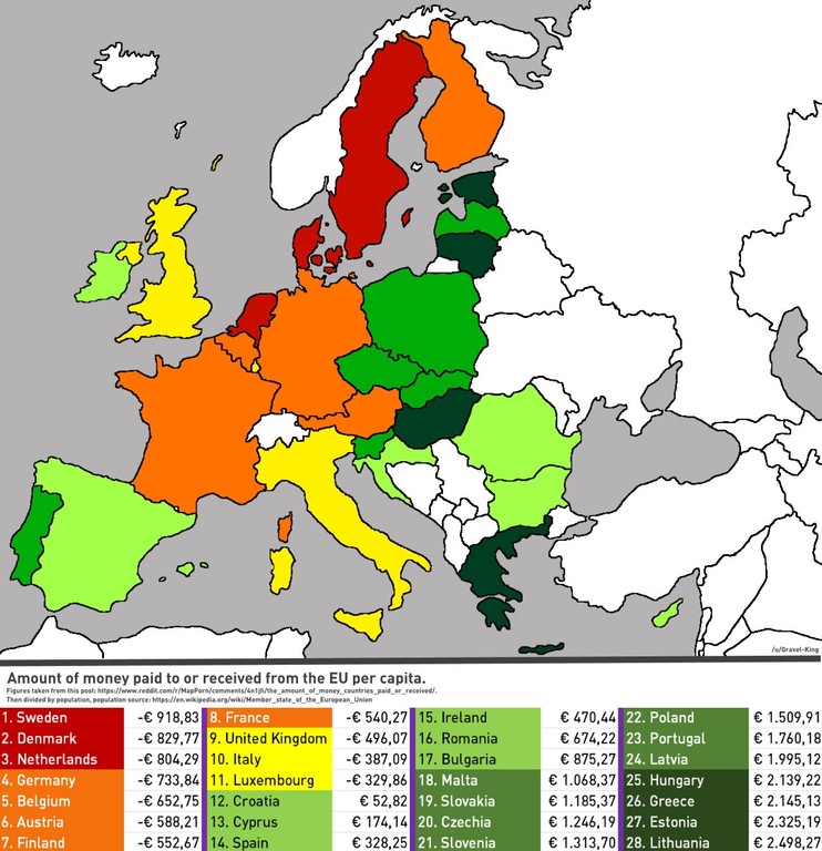
EU contribitions per capita 2010-2014 (map by Gravel King)
