From Maps of War
5,000 years of the Middle East in 90 seconds
From Maps of War
5,000 years of the Middle East in 90 seconds
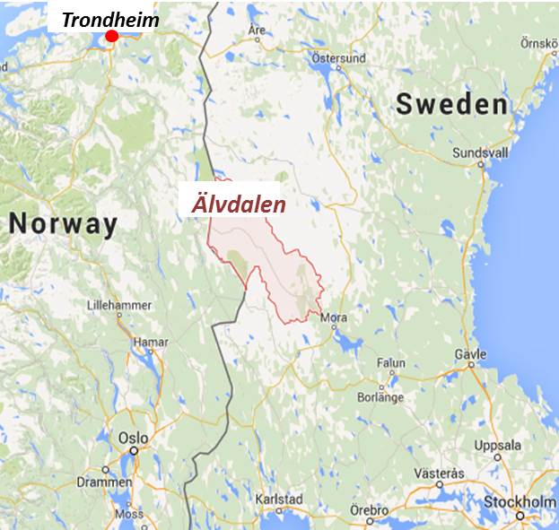
In my previous post I suggested that the municipality of Älvdalen in the county of Dalarna in Sweden was probably as close as one could get to Tolkien’s Lothlorien.
I have posted earlier about Peter Bird’s wonderful mapping of Middle Earth to a pre-Holocene Europe where sea levels would have been some 120m lower than today.

Assuming
since the Fellowship of the Ring travelled south and east from Rivendell and through the Gates of Moria across the Misty Mountains to get to Lothlorien, then,
it follows that present day Trondheim maps to Rivendell of Middle Earth.

Frodo’s Journey Rivendell to Lothlorien
On 28th June it will be 100 years since the assassination in Sarajevo of Franz Ferdinand, heir to throne of the Austro-Hungarian Empire and the onset of World War 1. The maps of Europe changed drastically before and after the War from 1914 to 1920 and this is a an excellent yet simple presentation of the changes.

Before and after WW1
But it is worth noting that squabbling in Europe was going on long before WW1 and still continues today with the Balkans having recently redrawn their maps. And maps will continue changing, as in the Crimea and now perhaps also with Scotland breaking away from the United Kingdom.
But it is not so long ago that the map of Europe looked completely different. After Napoleon’s defeat at Waterloo in 1815 the Congress of Vienna redrew the map of Europe.
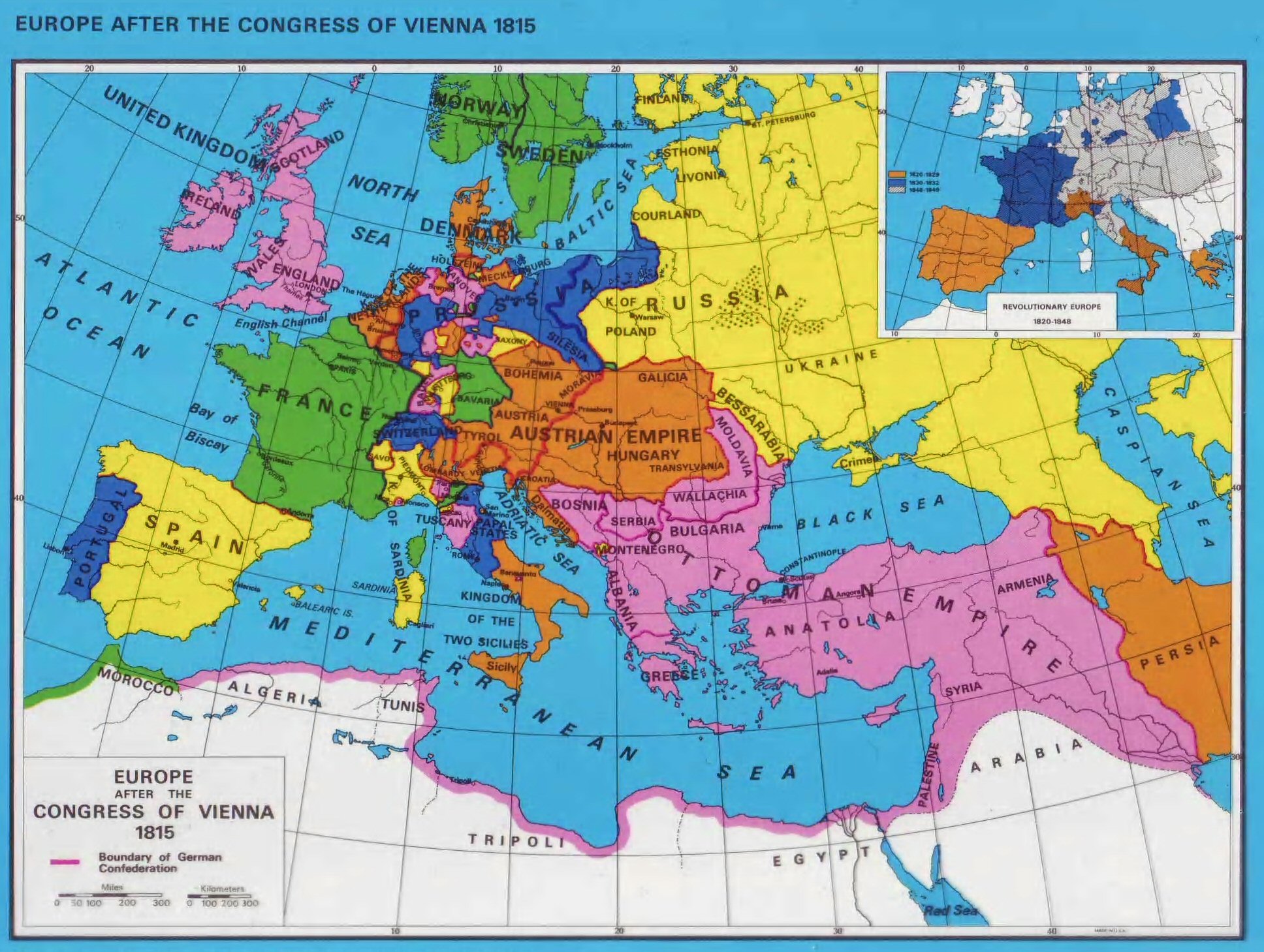
europe after vienna 1815
And now, 200 years later the map of Europe is still changing. This map by Omniatlas is up to date as of March 2014.

Omniatlas map of Europe 2014
What will the next 100 years bring?
Even little Madagascar (22 million population) is as large as the UK in area!
Behold: major countries of the world, overlaid atop an outline of the positively giant African continent.
If this is your first time seeing this comparison (click here to see it in hi-res), you might be surprised by Africa’s immensity.

The True Size of Africa
Some 45 years ago when I first read Tolkien, I recall making (or trying to make) a relief map of Middle Earth on cardboard with crumpled paper and glue and paint and plasticene for the relief features. I never had the patience to get it quite finsished and it was too large to survive my many moves as a student. But maps and cartography have fascinated ever since.
I have just come across this map of Middle Earth which – I think – is about 10 years old. Peter Bird is Professor Emeritus at the Department of Earth, Planetary, and Space Sciences of UCLA and this map of Tolkien’s Middle Earth is from his personal page. Here he superimposes Middle Earth onto a Europe at a time when sea levels (in my estimation) were more than 100m lower than they are today. All very fanciful of course, but interesting and for me very nostalgic.
From Frank Jacobs at strange maps:
But, as Tolkien states in the prologue to ‘The Lord of the Rings’, it would be fruitless to look for geographical correspondences, as “Those days, the Third Age of Middle-earth, are now long past, and the shape of all lands has been changed…” And yet, that’s exactly what Peter Bird attempts with the map here shown. Bird, a professor of Geophysics and Geology at UCLA, has overlapped the map of Middle-earth with one of Europe, which leads to following locations:
- The Shire is in the South-West of England, which further north is also home to the Old Forest (Yorkshire?), the Barrow Downs (north of England), the city of Bree (at or near Newcastle-upon-Tyne) and Amon Sul (Scottish Highlands).
- The Grey Havens are situated in Ireland.
- Eriador corresponds with Brittany.
- Helm’s Deep is near the Franco-German-Swiss border tripoint, close to the city of Basel.
- The mountain chain of Ered Nimrais is the Alps.
- Gondor corresponds with the northern Italian plains, extended towards the unsubmerged Adriatic Sea.
- Mordor is situated in Transylvania, with Mount Doom in Romania (probably), Minas Morgul in Hungary (approximately) and Minas Tirith in Austria (sort of).
- Rohan is in southern Germany, with Edoras at the foot of the Bavarian Alps. Also in Germany, but to the north, near present-day Hamburg, is Isengard. Close by is the forest of Fangorn.
- To the north is Mirkwood, further east are Rhovanion and the wastes of Rhûn, close to the Ural mountains.
- The Sea of Rhûn corresponds to the Black Sea.
- Khand is Turkey
- Haradwaith is the eastern part of North Africa, Umbar corresponds with the Maghreb, the western part of North Africa.
- The Bay of Belfalas is the western part of the Mediterranean.

Middle Earth by Peter Bird
Allowing for polar wander and sea level change, most sites are recognizable. The southern Hithaeglir and northern Ephel Duath have sunk, unless perhaps they were only illusions that have been dispelled.
I have only just come across this.
The “Histomap,” was a tour-de-force of his time, created by John B. Sparks, an amateur historian and was 5 feet long and covered 4,000 years of global history. It was first printed by Rand McNally in 1931 and was marketed for just $1.00. Inevitably his “map” is Occidental-centric but it is still a quite remarkable piece of work.

Histomap advertisement (Yale Library)
The map itself – fully zoomable – can be found at the David Rumsey Map Collection

Histomap by John B Sparks
One would assume the map effaces singularities or any singular historical narrative–the selective condensation of information to an image five feet in length in the Histomap can’t be beat for charting a balance of power among world cultures, reifying the state and racial difference as the metric by which to map world history.
Convenience and efficiency are both premiums in its design. As other early twentieth-century compendia of knowledge, the map glories in positivist presumptions of mappability: rather than offering narrative, the map offers the inverse, apparently obliterating any local meanings: it homogenizes four thousand years not by relinquishing narrative structures, but using a racial rubric to map states’ “relative power.”
Sparks devised the Histomap as both more ecumenical and empyrean in its economic individuation of purified vision of history, and more global. Its color-keyed streams are readily comprehensible consultation of the lay reader, but the green dust jacket assured prospective they would be overwhelmed by “the fresh realization of the very recent insignificant contribution to history of those we are accustomed to call great men,” as the map would leave them ”enthralled.”
Starting from the Minoans and the Settlement of the Nile Delta, this occidentalist condensation of some four-thousand years “relative powers of contemporary states, nations, and empires,” is the distillation of an era of state-building–a narrative to which it accommodates the dynastic division of time among the Egyptians Ammorites, and Chinese, to digest their otherness in a river of time. By erasing the Neolithic, as it were, the streams contemporaneously arise, like Athena from Zeus’ head, with the force of a declarative statement.
Each stream is distinctly separate, and as one wanes another takes its place to expand, in the uniform frame of mankind:
Geography (as globalism) is a big casualty in this visualization of time, indeed, as one stream–here the Roman–comes to fill the viewer’s field of vision from around 150 BC, as it fills not only the historical record, but the balance of world powers. Although this was long before the notion of such a balance existed or was understood, this was the optic in which Sparks so skillfully visualized a universal history, and, more to the point, made sense to lay readers of the 1920s and 30s.
John Sparks followed up with a historical map of evolution in 1932.
There are no good antonyms in English for the verb “discover”. In this particular case where an island was apparently “discovered” a long time ago, which was then included on many maps and which is now found not to exist, such words as “loss” or “concealment” or “miss” or “cover up” don’t quite fit.
But in this age of satellite imagery and GPS it is more than a little surprising that such an “error” – if error it was – could survive for so long!
I suspect that a clever hoaxer – once upon a time – invented the island, introduced it into some reference map and is now laughing his socks off !!!!
So an “undiscovery” it is.
A South Pacific island, shown on marine charts and world maps as well as on Google Earth and Google Maps, does not exist, Australian scientists say.
The supposedly sizeable strip of land, named Sandy Island on Google maps, was positioned midway between Australia and French-governed New Caledonia.
Sandy Island – “Now you see it now you don’t” image BBC/Google
But when scientists from the University of Sydney went to the area, they found only the blue ocean of the Coral Sea.
The phantom island has featured in publications for at least a decade.
Scientist Maria Seton, who was on the ship, said that the team was expecting land, not 1,400m (4,620ft) of deep ocean.
“We wanted to check it out because the navigation charts on board the ship showed a water depth of 1,400m in that area – very deep,” Dr Seton, from the University of Sydney, told the AFP news agency after the 25-day voyage.
“It’s on Google Earth and other maps so we went to check and there was no island. We’re really puzzled. It’s quite bizarre. ……
…… Australia’s Hydrographic Service, which produces the country’s nautical charts, says its appearance on some scientific maps and Google Earth could just be the result of human error, repeated down the years.
A spokesman from the service told Australian newspapers that while some map makers intentionally include phantom streets to prevent copyright infringements, that was was not usually the case with nautical charts because it would reduce confidence in them. …. ….. while most explorers dream of discovering uncharted territory, the Australian team appears to have done the opposite – and cartographers everywhere are now rushing to undiscover Sandy Island for ever.
With both landmass and population concentrated in the Northern hemisphere, a northern-centric view of the world in most things is inevitable.
I was looking for some information on population distribution by latitude and came across this graph on Chris Blattman’s site. However he was not the source of the diagram but had obtained the image from Paul Kedrosky’s page which still exists but no longer has the image. He in turn referred to a Bill Rankin whose page no longer exists. The diagram is said to be from 2000 data but I have not been able to find the source or anything more recent. An excellent diagram.
UPDATE: The original seems to be here: http://www.radicalcartography.net/index.html?histpop
POPULATION HISTOGRAMS
Bill Rankin, 2008More fun with numbers! Roughly 88% of the world’s population lives in the northern hemisphere, and about half the world’s population lives north of 27°N.
Taking the northern and southern hemispheres together, on average the world’s population lives 24 degrees from the equator.

World population by latitude and longitude: source unknown (via chrisblattman)
Trying to trace some of the data on which this diagram is based I came across the fascinating work of Waldo Tobler. Professor Emeritus. Geography Department. University of California. In his presentation from 1999 on Unusual Map Projections I found two diagrams which – I think – must be the source (perhaps updated) for the diagram above. Unusual Map Projections Tobler 1999
The German aerospace centre announced today that
On 14 October 2010, the radar satellite TanDEM-X moved into close formation with its ‘twin’, TerraSAR-X. Before this, the two satellites were orbiting 20 kilometres apart – a flight time of almost three seconds. Now, there are only 350 metres separating the pair, which means their antennas are able to acquire radar images of the same area simultaneously.

Premiere – TerraSAR-X and TanDEM-X now flying in close formation
The objective of the mission is to create a high-precision, three-dimensional digital elevation model of Earth’s land surface. The project needs the satellites to operate in parallel for a period of three years. The transition to close formation flight marks the beginning of the final preparatory stage of the TanDEM-X mission. The routine operations phase is due to start in early January next year.
The TerraSAR-X and TanDEM-X orbit trajectories, patented by DLR researchers, are like the strands of a double helix – they circle around one another without crossing. The team of scientists based in DLR Oberpfaffenhofen took just three days to carry out the approach in preparation for the final formation flight. “First, we had to manoeuvre TanDEM-X to reduce its orbital period, so that the satellite could ‘catch up’, reducing the 20 kilometre gap between it and TerraSAR-X. After two further manoeuvres we brought the distance between the pair down to 350 metres,” explains DLR flight dynamics expert Ralph Kahle.
The reduced distance between the satellites means that the two radar systems can be synchronised for the first time. TerraSAR-X and TanDEM-X can also monitor each other’s ‘health’ via an inter-satellite link. “This is completely uncharted territory. Never before have two satellites worked in such close formation over a period of several years,” says Manfred Zink, Project Manager for the TanDEM-X Ground Segment. Eckard Settelmeyer, Director of Earth Observation and Science at Astrium, adds: “This dual mission will give another boost to satellite-supported applications and science.”
Read the whole article:
http://www.dlr.de/en/desktopdefault.aspx/tabid-1/117_read-27086/
Der Spiegel reports: Berlin Researchers Crack the Ptolemy Code
A 2nd century map of Germania by the scholar Ptolemy has always stumped scholars, who were unable to relate the places depicted to known settlements. Now a team of researchers have cracked the code, revealing that half of Germany’s cities are 1,000 years older than previously thought.

Magna Germania
A group of classical philologists, mathematical historians and surveying experts at Berlin Technical University‘s Department for Geodesy and Geoinformation Science has produced an astonishing map of central Europe as it was 2,000 years ago.
Ptolemy: Bildarchiv Hansmann/Interfoto
The map shows that both the North and Baltic Seas were known as the “Germanic Ocean” and the Franconian Forest in northern Bavaria was “Sudeti Montes.” The map indicates three “Saxons’ islands” off the Frisian coast in northwestern Germany — known today as Amrum, Föhr and Sylt.
It also shows a large number of cities. The eastern German city that is now called Jena, for example, was called “Bicurgium,” while Essen was “Navalia.” Even the town of Fürstenwalde in eastern Germany appears to have existed 2,000 years ago. Its name then was “Susudata,” a word derived from the Germanic term “susutin,” or “sow’s wallow” — suggesting that the city’s skyline was perhaps less than imposing.
This unusual map draws on information from the mathematician and astronomer Ptolemy, who, in 150 AD, embarked on a project to depict the entire known world. Living in Alexandria, in the shadow of its monumental lighthouse, the ancient scholar drew 26 maps in colored ink on dried animal skins — a Google Earth of the ancient world, if you will.

Image via Wikipedia. Roman Empire in 116 AD


